All businesses are going online and the website is becoming the primary platform for marketing and establishing any business. The customers usually check the website before entering into business with any company. If you are having your business online or even if your business is not established online, you may definitely have the website that works for the popularity of your website. The website being such an important platform, it has further been important for the website owners to come up with the responsive website design for their customers. The responsive design is the need of the current internet era and hence every business may start looking for the responsive design to get the maximum benefit from their business.
Responsive Website Design – Introduction
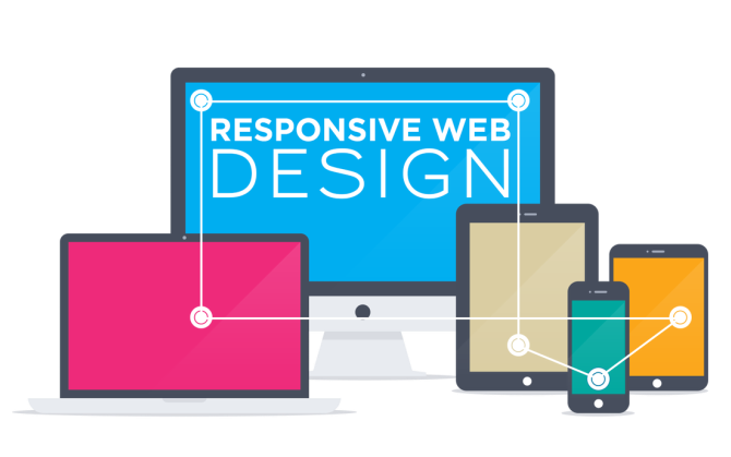
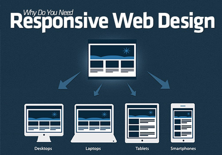
The responsive website is the website that works on each and every platform. It can be browsed from any browser and hence the popularity of such website is quite high. The website users are now browsing the websites from various devices like tablet, Smartphone, laptop or desktop. The browsing of the website on the move has become quite popular with more and more use of the Smartphone for the same. The responsive website would be the one that is conveniently browsed from any of these devices and fits the screen size well.
Why you need the responsive website design?
The visitors of the website would enjoy browsing the website only if it is having the user friendly format that can be browsed as per their convenience. When the website is visited from the mobile, it becomes important that it is in readable and understandable form so that the user can browse it comfortably. The online shopping portals may become instantly popular if they are available for all the platforms. The benefits of the responsive website are given here to help you understand its need for your business.
There are many benefits of the responsive website design and hence every business is now looking for such website to get the best business opportunities online.
Responsive Website Design – Introduction
The responsive website is the website that works on each and every platform. It can be browsed from any browser and hence the popularity of such website is quite high. The website users are now browsing the websites from various devices like tablet, Smartphone, laptop or desktop. The browsing of the website on the move has become quite popular with more and more use of the Smartphone for the same. The responsive website would be the one that is conveniently browsed from any of these devices and fits the screen size well.
Why you need the responsive website design?
The visitors of the website would enjoy browsing the website only if it is having the user friendly format that can be browsed as per their convenience. When the website is visited from the mobile, it becomes important that it is in readable and understandable form so that the user can browse it comfortably. The online shopping portals may become instantly popular if they are available for all the platforms. The benefits of the responsive website are given here to help you understand its need for your business.
- Better business opportunity as the users may be able to visit the website anytime and from anywhere. There would be no restriction or boundaries while shopping as the online shopping portals would be able to offer shopping from mobiles and tablets.
- More visitors and website traffic as the users of all types of dev ices would visit the website. The users may browse the website on the move and hence they may spend more time on the website.
- Faster browsing as the website adapts to the screen size well. The user may enjoy faster browsing experience and hence they will return to the website again and again.
There are many benefits of the responsive website design and hence every business is now looking for such website to get the best business opportunities online.
 RSS Feed